Plus Tidal, Deezer, Rhapsody, Beats Music, Google Play and other digital services, as Information Is Beautiful updates its 2010 infographic

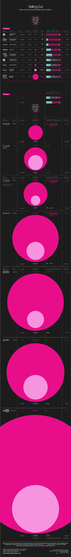
In 2010, data journalist and information designer David McCandless published an infographic on his Information is Beautiful website showing how much musicians earned online from sales and streams of their music.
It caused quite a stir within the music industry, which even then was debating what the emergence of streaming services like Spotify would mean for artists. In 2015, that debate is still going on, and it’s even more heated.
Now McCandless has created a new version of the infographic, updated for 2015.
As before, it digs in to stats from various digital music companies, from the likes of Bandcamp, iTunes and Amazon that sell music, to streaming services: Spotify, Deezer, Apple’s Beats Music, Rhapsody, YouTube and Tidal.
Besides calculations for how much an artist can expect to earn from a single sale or stream, the infographic shows how many of those sales or streams they’d need to earn the US monthly minimum wage of $1,260.
Some important caveats: these numbers apply to performing musicians, but they do not include publishing royalties for the songwriting. Plus, the most important factor in how much an artist signed to a label earns is the terms of their contract: some have good, fair deals. Others… less so.
Averaging that out is also the reason why the figures here may not match those announced by the streaming services.
For example, Spotify says that its average payout for a stream to labels and publishers is between $0.006 and $0.0084 but Information Is Beautiful suggests that the average payment to an artist from the label portion of that is $0.001128 – this being what a signed artist receives after the label’s share.
Finally, the per-play figures for streaming service can be misleading, as they depend on how many (or few) users the service has. Beats may pay more per-stream than Spotify, but that’s because it has relatively few users.
Artists will be making a lot more money in aggregate from Spotify, and if Beats’ user numbers grow, its per-stream payouts will come down. So this graphic isn’t proof that one service is better for artists than another, in that sense.
Information is Beautiful has included a metric of “users per play needed” – the little dots at the bottom right of each circle – to reflect this.
Even so, it’s a great conversation-starter. The full infographic is embedded below, while McCandless’ other recent work can be found in his Knowledge is Beautiful book.